Visual Hierarchy · Page 5 of 7
What’s the personality?
Fonts give a voice its personality, whether playful, sporty or traditional.
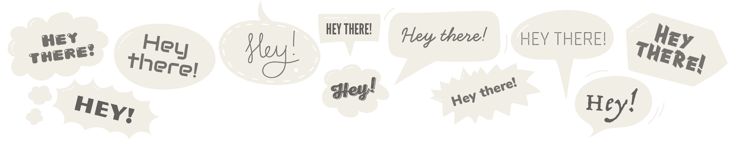
How to use fonts effectively
Choosing the right font is like picking the right relative to sit next to at a family reunion. You wouldn’t seat your Great Aunt Mildred, with her booming voice and tendency to overshare, next to your reserved cousin Timmy. The wrong font pairing creates the same kind of awkwardness, so remember: compatibility is key.
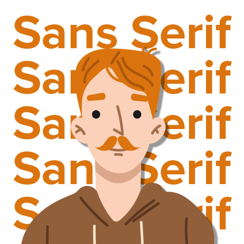
Sans serif
Sans serif fonts are like the guest who shows up in jeans and a T-shirt while everyone else is dressed up, and still looks effortlessly stylish. They’re no-nonsense and don’t let their personality overwhelm the space.
Use for
- Modern designs
- Neutral text with minimal personality
- Screens: apps and websites
- Signs and wayfinding
Sans serif fonts work well on screens because they keep their detail and shape on screens with low pixel density.
Key characteristics
- No decorative strokes (serifs) at the ends of letters
- Consistent line weight
- No extra ligatures or ornaments
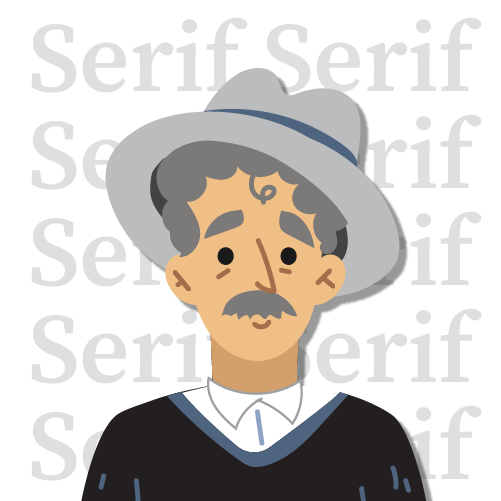
Serif
Serif fonts are common and traditional, like the person who wears glasses just to look smarter. “I may have some extra embellishments, but that just means I’m fancy and approachable.”
Use for
- Traditional designs
- Print: books and magazines
- Signs and wayfinding
Serif fonts are easier to read in printed text. The serifs form a line along the bottom of the letters that helps you keep your place, and the thick-and-thin strokes make letters easier to identify.
Key characteristics
- Small decorative strokes (serifs) at the ends of letters
- Usually varied line weight within letters (contrast)
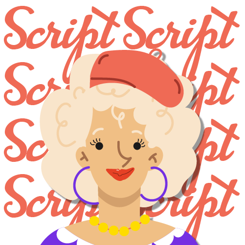
Script
Script fonts are like a friend who always shows up overdressed to casual events, making everything look a little fancier and a lot more dramatic.
Use for
- Fancy or formal designs
- Handmade looks (handwriting scripts)
- Invitations and announcements
- Packaging
Avoid setting script fonts in all capitals. They were designed for lowercase with capitals used sparingly, and all caps looks amateurish.
Key characteristics
- Cursive letterforms
- Flowing, organic appearance
- Mimics handwriting or calligraphy
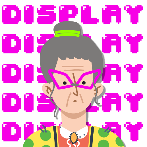
Display
Display fonts are the life of the party, even when the party is a simple poster. They crash onto the page like a rock star diving into a mosh pit: flashy, attention-grabbing and a bit over the top.
Use for
- Headings
- Logos
- Pull quotes
- Eye-catching elements
Display fonts are often too detailed or irregular for the clarity body copy needs.
Key characteristics
- Boldness
- Ornamentation
- Uniqueness
- A specific mood or tone
Font categories in use
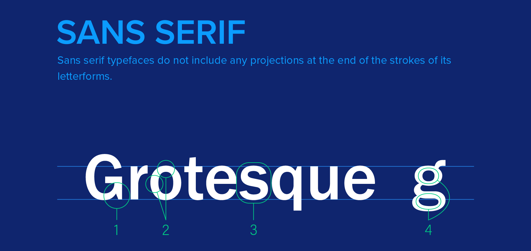
Sans serif sample
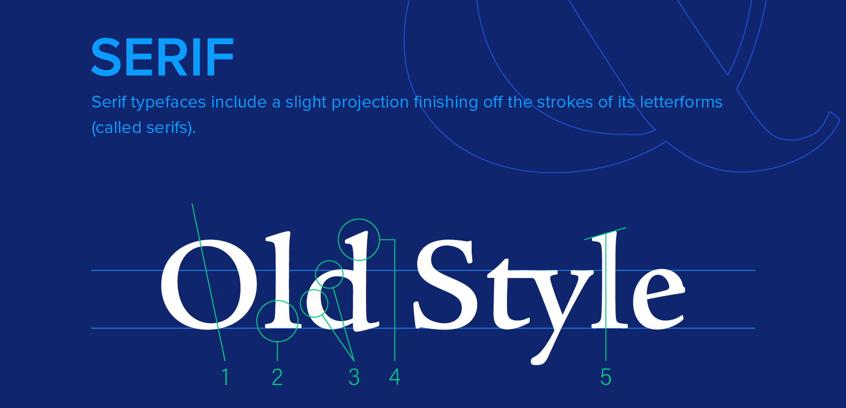
Serif sample
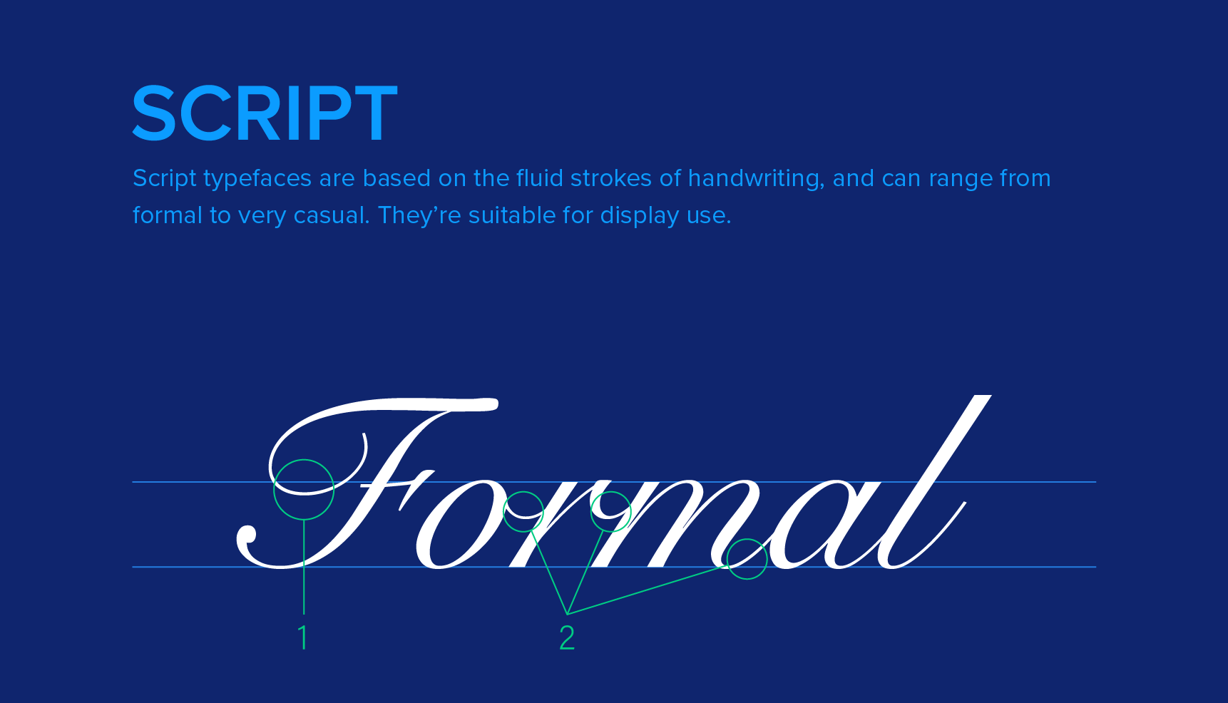
Script sample
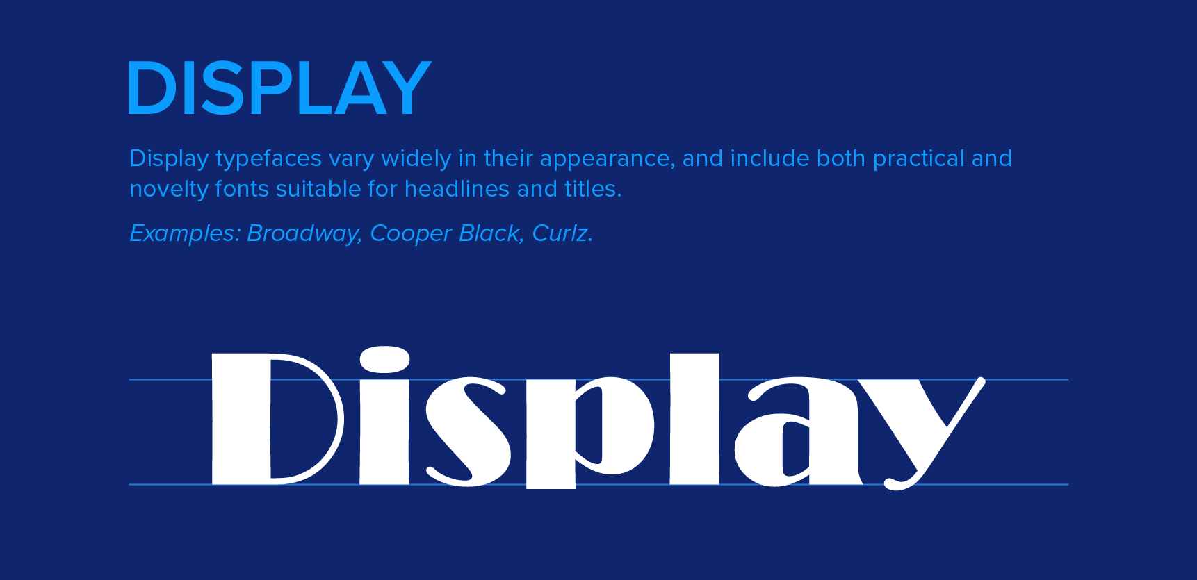
Display sample
© Created by Sara Rosenstock, Marietta College Graphic Design.