Visual Hierarchy · Page 2 of 7
Why does it matter?
Hierarchy controls the order in which people notice things. Without it, everything competes for attention.
Finding the right amount of emphasis

Too much emphasis
This design looks like a chaotic family reunion where everyone’s shouting at once and nobody knows who’s in charge. Everything is emphasized: everyone is shouting.
Too little emphasis
This design looks like a room full of introverts where everyone’s whispering and you can’t hear anything. Nothing is emphasized: everyone is whispering.
Just right
This design looks like a room full of people, but you can hear the voices you want to hear. Some elements are emphasized with scale and placement, while others recede into the background.
Our eyes follow a pattern
Without a strong visual hierarchy, our eyes follow a predictable pattern: left to right and top to bottom. The pattern is shaped like an F or a Z.
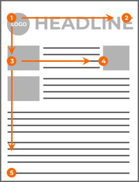
F-pattern
Most common in text-heavy designs. Viewers start at the top left, move across to the top right, then scan down the left side looking for short headlines or subheads to read across.
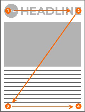
Z-pattern
Less dense designs follow a Z. Viewers start at the top left, move across to the top right, look down a backward diagonal to the lower left, then across to the lower right.
Which pattern?
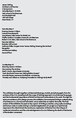
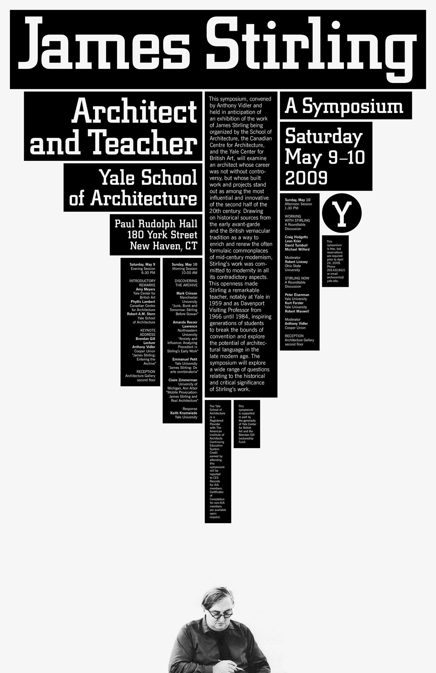
Look at each layout. Does your eye follow an F or a Z?

Example 1

Example 2
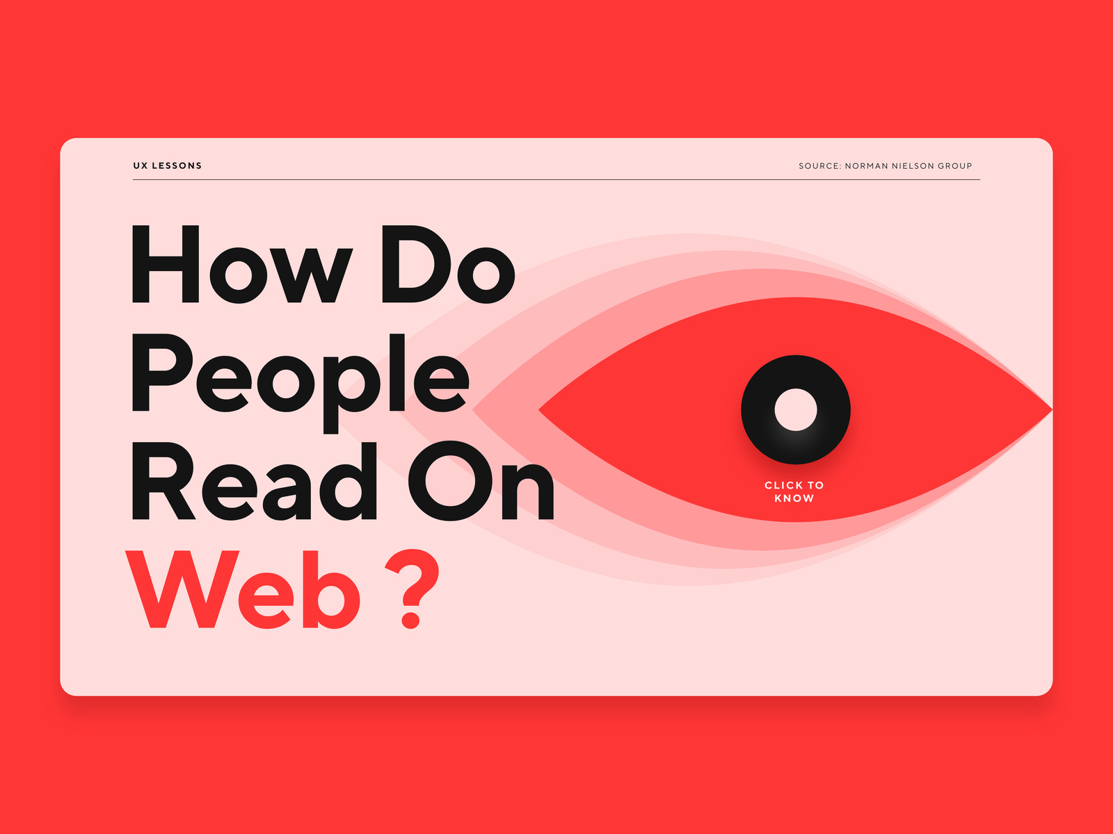
Example 3

Example 4
© Created by Sara Rosenstock, Marietta College Graphic Design.