Visual Hierarchy · Page 7 of 8
What goes wrong?
Real signs, billboards and posters where everything shouts at once, and what each one gets wrong.
When every element asks for attention, none of them gets it. Look at each example before you read its caption. Where does your eye go first? Can you find the most important message in a few seconds?
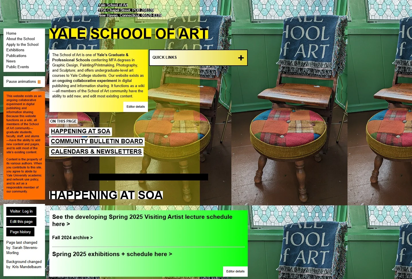
Yale School of Art website
The Yale School of Art’s website has often been criticized for its overwhelming and disorganized design. It is a really bad graphic design example.
With too many fonts, colors, and competing visual elements, the site creates a chaotic experience that makes it difficult for users to find what they’re looking for — a clear case of design getting in the way of communication.
Source: yale.edu
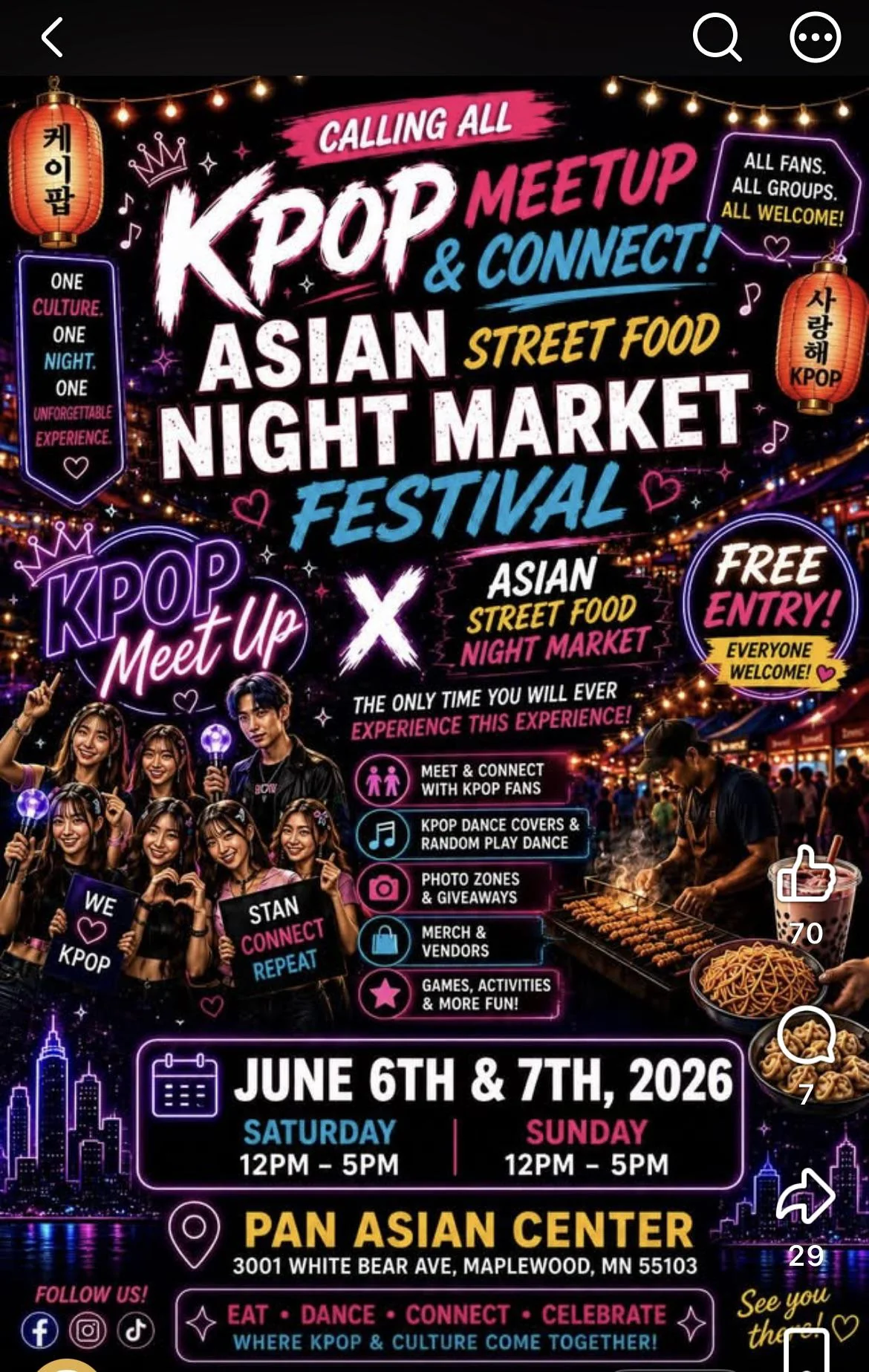
AI-generated event poster
Posters made with AI image tools tend to look alike: neon lettering on a dark background, glowing badges and outlines, string lights, sparkles, a city skyline and a crowd of generic smiling faces. When every event uses the same look, this one blends in with all the others, and nothing tells you what makes it different.
- Too much content. The event name appears twice, once as the main headline and again in the “KPOP Meet Up × Asian Street Food Night Market” lockup. Add the slogans, badges, an icon list, two photos and a footer, and there’s no empty space left to rest your eye.
- Color emphasizes everything. Pink, blue, yellow and white each highlight different words in almost every line. When every phrase gets a bright color, color stops signaling what’s important.
- Color isn’t consistent. Content that belongs together is colored differently. “Saturday” is blue but “Sunday” is pink, the icons in the activity list switch between pink and blue, and “Street Food” is yellow in the headline but split between yellow and pink in the lockup. The colors don’t form groups, so they can’t help you sort the information.
Better: Say the event name once, cut the extra slogans, and give the date and place clear space. Pick one accent color for the most important information and use it the same way every time.
AI-generated event poster, shared on social media.
If everything is important, nothing is. Pick one message to lead, and make everything else step back.
© Created by Sara Rosenstock, Marietta College Graphic Design.